How To Composite Charts In Excel
January 8, 2021 2022-05-26 11:24How To Composite Charts In Excel
How To Composite Charts In Excel
Hello, in this session we’re going to look at combination charts. Firstly, click on the data, and using altf1, we will create a quick chart. Resize this chart and double-click on it. We can see it over the right side of the formatting area. What we can do is, hover up towards the top of this area. We can actually make it float and bring it over the chart, making it a bit easier to use. We can see the chart title relatively meaningless it’s not actually picked up anything.

The Formula Bar
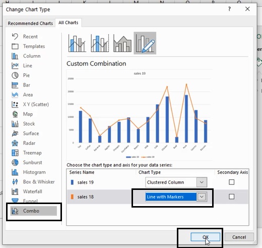
If we go up to the formula bar and click in there, we can type equals and point to any cell. We can’t combine cells, it has to be one cell and now click on the cell b3, and the chart title is now dynamically linked to cell b3 anytime. The dynamic title will change. If we want to emphasize 19 over cells 18, we could use a combination chart now. The easiest way to create a combination chart is probably just to click on one of these data series and then right-click.

How to Create a Combo Chart in Excel
Clicking on that brings up the menu at the bottom, and this is a combo chart. Alternatively, we can just go to change the chart type and click on the combo chart. We could make sales 18 into a dotted line. Click ok if we’d like to de-emphasize sales 18 over sales 19 further.
We could click on the sales 18 series we could then go to no line. Now we just have a dot. So, we can see what the previous year’s sales were, but it’s not overshadowing the current year’s sales. It’s clear which one we’re really looking at, and it’s just there as a comparator. It may be that we want to change the marker from a dot to something else.


That way you can understand how to create a combo chart in excel.
Use Marker Options
If we go into marker options, we can see that we have various options. If we click on built-in, we can maybe change that to a triangle, and perhaps, we will want to change the color from orange to yellow. If I click away, we can see that we have a yellow triangle with an orange outline, another piece of functionality to mention. If we select the data right click and change series chart type, we then bring up the combo box options.

Secondary Axis
We have the option to click on the secondary axis if we put sales 18 on the secondary axis. Click ok we can now see that we have a different axis over the right-hand side, and the scaling is different. This can be pretty useful, but you just need to be a little bit careful that the user doesn’t get confused by having a different scale on the right-hand side from the left-hand side. Thank you!


