Pivot Tables in Excel
August 21, 2019 2022-05-26 7:47Pivot Tables in Excel

Pivot Tables in Excel
Do you want to organize your data set and make sense out of it? Don’t want to spend thousands of dollars on data analysis software? Do you want a simple yet effective way of number crunching?
Excel Pivot Table is exactly what you are looking for!
What are Pivot Tables in Excel?
Pivot Table is one of the most powerful features of MS Excel that enables you to extract helpful conclusions out of seemingly large clutters of data set. If you are using Excel just to input data, then you are not utilizing the true potential of this software. When it comes to creating summarized data, easy-to-read tables, and customized charts to study trends and compare different data set, nothing can beat an Excel pivot table.
Pivot Table in Excel becomes more useful if you have large numbers of rows and columns and you need to group the data together in different ways to conclude. You can easily drag and drop rows and columns to summarize, analyze, explore and present the data.
Even if you are not well versed in the use of Excel, you can easily learn how to make a Pivot Table in Excel. In fact, in many scenarios, you need to learn the use of Pivot Table in Excel, which is much faster and easier than using complex Excel formulas.

Above is a screenshot of data that was inserted in Excel. The data simply represents sales made by customers on different dates. The first thing you would want to know on looking at the data would be the total sales made by a specific customer. You can use a Pivot Table to easily calculate the total sales made by each customer. It would take only a few seconds and would be super easy.
So, let’s get started with the steps on how to create Pivot Tables.
- Select the data you want to analyse
Click anywhere on the data and click Ctrl+A to highlight the entire table including the headers. Make sure there are no blank rows, columns or cells in the data table.
2. Choose “Pivot Table” from the “Insert” tab.
You will find “Insert Tab” on the left side of the top ribbon in Excel. Click on that and from there click on “Pivot Table” under Tables section.

3. Create the Table
“Create PivotTable” dialog box will appear.
Since you have already highlighted the entire table range, the “Select a table or range” option is already marked.

You can also choose where you want the PivotTable to be placed, either on the existing worksheet or in a new worksheet. By default, your pivot table will open in a new worksheet tab.
It is recommended to keep it that way so that your reports do not get messy. You can easily swap between the sheets if you want to refer to the data source.
Lastly, click on “OK”.
4. Open the new worksheet tab
A PivotTable template is created on a new sheet.

On the left side of this sheet is the placeholder where you will find the new Pivot Table displayed once you have defined it.
On the right side, you can see a dialog box of PivotTable Fields where you will define how the Pivot Table will look. To get your desired report, simply drag and drop the Pivot Table fields into the four areas – Filters, Columns, Rows, and Values.
- Choose the Field and drag it to the desired area
Let us now use this Pivot Table template to perform certain calculations and results. For instance, create a table that calculates the total unit sold by a different channel.
Select “Channel” Field and drop it to “Rows” area and then select “Unit Sold” field and drop it to “Values” area and your report will be ready. It is that simple once the template is created.

If you want to remove some field you dragged in, just drag it out and drop – it’ll go away.
This data shows you the total units sold per channel. You can also add filters to this data. For example, you want to know the total units sold by channels but for a particular Product ID only.
Just add the field Product ID in the Filter section and click on the leading mechanics service trucks with a crane in Phoenix and arrow to expand the selection. Then, click on Select Multiple Items and check on the products you want to filter.
- Change the value field.
If you want to summarize the value field by something other than Sum, it can be done as well. Click on the small arrow next to Sum of Unit Sold in the Values area. Then click on Value Field setting, and select any other option like average, count, max, min, etc.

- Shuffle/Rotate the information
For instance, if you now want to see the total units sold by different countries you do not need to start from scratch. Simply uncheck “Channel” box and click on “Country” box instead.

In this way, you can use Pivot Tables to create customized reports in a quick and easy manner. Using Pivot Tables improves your analytical representation, reduces manual error and saves time.
Refresh a Pivot Table
If you update the data source, you need to refresh the Pivot Table to see the changes. To do that, follow the steps below:
- Click any cell on the Pivot Table
- Right Click on the cell and click on Refresh.

Alternatively, you can click anywhere in the PivotTable to show the PivotTable Tools on the ribbon. Click Analyse > Refresh or press Alt+F5.


To update all PivotTables in your workbook at once, click Analyse > Refresh All.
Format Pivot Tables in Excel
After looking at how to create Pivot Tables, let us now explore the various ways to enhance the report layout and format to make the data more user-friendly and powerful.
Below are some of these awesome formatting tricks!
- Moving Rows or Columns
By default, Excel will list the data in rows and columns in alphabetical order. If you want the labels in a nonalphabetical order, you can move them manually. To change the order, right click on the data and click on Move. Select Move up, down, beginning or end as you require.

2. Expand or Collapse Field
If you have more than one field in the row, you can use the plus/minus button to expand or collapse details based on your requirement. To expand or collapse the ENTIRE field, click on the expand (+) and collapse (-) field buttons for each item in the field.
If the buttons are not visible, click on the Pivot > Go to Analyse Tab > Click on Buttons.

3. Format Error and Empty cells
If you have empty cells or cells containing errors, you can format the character you want to display on those cells. To customize the display, right click on the Pivot, Go to Pivot Table Options > Under Layout & Format Tab > For empty cells show: “NA” and for error value show: “NA”.

4. Change the layout of the Pivot Table
If your data is currently in a compact outline, you can convert the pivot into a Tabular Format which will separate “City” and “Category” into two different columns.
For this, you have to click on the Pivot Table > Click on Design Tab > Click on Report Layout under Layout section > Click on “Show in Tabular Form”.

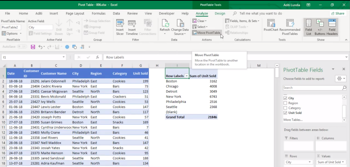
5. Move the Pivot Table
If you have a Pivot Table in a worksheet containing the data source and you want it in a new worksheet, you can just move it.
Click on the Pivot Table > Go to Analyse Tab > Click on “Move PivotTable”
6. Insert a Blank Line after each Item
Go to Design Tab > Under blank rows > You can choose to add or delete a blank row after each item.

7. Change the formatting of the Pivot Table values
To change the formatting of values in the Pivot Table, follow the steps below:
Right click on the cell > Click on Value Field Setting > Click on “Number Format” > Apply the Required Formatting > Click OK.


Sort Pivot Table in Excel by Values
To sort the Pivot Table by values, click on any cell within the column you want to sort. On the Data tab of the Excel Ribbon, click the A-Z command or the Z-A command to sort in ascending or descending order. Alternatively, you can also right click on the cell, then click on “Sort” and choose the sorting option accordingly.

In the screenshot below, you can see that there are two rows that need to be sorted independently.

This can also be done by the sorting option in Pivot. First, we will sort the Product field and then the outer field, City.
Select cell B5 > Go to Data Tab > Select A to Z.
This will sort the total sales for Products in ascending order.
Now, the outer field, City, can also have its total sales values sorted independently of the Product sales values. To do that, select cell B4 > Go to Data Tab > Select A to Z.
This will sort the total sales for City in ascending order, leaving the Products within each City are still sorted A-Z (smallest to largest).
Microsoft Excel Pivot Tables with Multiple Sheets
If you have two tables in two different sheets or on the same sheet, you can still create a Pivot Table using both the data sources. There are two important things that you need to check in order to make this process work:
- You must make sure that the data/range is converted into a table.
- There is a common row in both the tables that acts as a link between them. This will act as the Primary key for the first table and Foreign key for the second table.
Advantages of converting any range into a table:
- When you create a Table, Excel automatically applies specific formatting to it.
- Column headers are always visible, even when you scroll down your data.
- Excel Table shows drop-down lists in the column headers which allow you to filter your data.
- You can very easily add Totals to your table. Go to the Design Tab > check the “Total Row” checkbox.
- The range becomes dynamic i.e., if you create any formula after converting the range into a table and then add new rows to the tables, the formula will be updated automatically.
So, you can see that converting a range into Excel Table is not just data with a heading, it unlocks so many useful properties.
How you can do this conversion? Press Ctrl + A to highlight the entire range and then press Ctrl + T to convert it into a table. Isn’t it simple?
Since you will be dealing with many tables in a single workbook, it is advisable to name the tables for easy reference. Once the table is created, you will see a new tab named “Design” on the ribbon. Select the Design Tab > On the left side of the ribbon, the Table Name box shows a temporary name of Table1. Delete that name and give the table a new relevant name. (Make sure the name contains no spaces.)
Go back to the process of creating a Pivot Table from Multiple Sheets. Let’s take an example, we have two tables – Sales Data and Product List on two different sheets with Product as the common row for both the tables. Follow the steps below to combine the two tables and create a Pivot Table:
- Select any cell in the Sales Data table > Press Ctrl + A (to highlight the entire table) > Press Ctrl + T (to convert the range into a table).
- Go to Insert Tab > Select Pivot Table icon (the first icon in Insert tab).
- The “Create Pivot Table” dialog box will open; the name of the table will appear on the Table/Range area.
- Select “New Worksheet” (it will be selected by default).
- On the bottom, click the checkbox for Add this data to the Data Model. (This is a key step when trying to connect various tables in one Pivot).
- Then click OK.
- A new sheet will be created with a Pivot Table placeholder.
- On the dialog box with fields mentioned, you will see the “Active” has been selected on the top. Change it to “All” (to see all the tables that you created).

9. Go to Analyse Tab > Click on Relationships (This is done to link the Primary key to the Foreign key)
10. A “Create Relationship” dialog box will appear. Under Table dropdown select Sales_Data, under Column (Foreign) select Product, under related tableselect Product_List and under related column select Product. Then click OK. The Sales data and Product List table are related where they are a matchingProduct.

11. In the All section, click on the small arrows to open the two tables and see the columns it contains. Now, you can easily drag and drop a column fromeither of the tables to create the desired Pivot Table.
Excel Pivot Chart
Pivot Charts are used to graphically represent your data to summarize and analyse data, trends, and patterns. It is commonly used when the data is too large to organize and understand. Pivot charts and pivot tables are connected.
The key difference between a normal chart and a Pivot Chart is that a normal chart uses a range whereas a PivotChart uses the data summarized in PivotTable. Thus, making a Pivot chart dynamic in nature.
There are two methods in which a Pivot Chart can be created. One in which you add a Pivot Chart to an existing Pivot Table, and the other in which you create a Pivot Chart from scratch.
Method 1: Adding Pivot Chart to existing Pivot Table
- Click on any cell on the existing Pivot Table.
- Go to Insert Tab and > Click on “Chart” and then go to “Pivot Chart”.

3.Select the desired chart from the options available (like pie, line, bar, etc.) and then click OK.
4. A new pivot chart in the same worksheet will be inserted where you have your pivot table. The chart will use pivot table rows as axis and columns as the legend.
Method 2: Adding Pivot Table from start
- Click anywhere on the cell containing the data
- Press Ctrl + A to select entire data
- Then press Ctrl + T to convert the range into a table
- Go to Insert Tab > Under Pivot Chart Select Pivot Chart & Pivot Table

All new sheet will be created that will contain both the Pivot table and Pivot chart.
A dialog box will appear that will have the table range and new worksheet as a place where the Pivot table will be reported, selected by default. Click OK.
It inserts both a PivotChart & PivotTable in a new worksheet.
Add the field to be inserted as Row in “Axis” area and the field to be inserted as Column in “Legend” area. Add Value Field and then filters if required.

This will create a dynamic Pivot Chart linked to the Pivot Table.

To change the chart type, right click on the Pivot Chart and select Change Chart Type. In the dialog box, select the desired chart type and Click OK.

To filter data from the Row or Column, click on the small arrow next to the name of the field written on the chart.
A search box appears with the list of all the data in that field, where you can check or uncheck boxes based on your choice.

To move the chart to a new worksheet, click anywhere on the chart. Go to Analyse Tab > Click on Move Chart Option > Move Chart Dialog Box will appear > Select New Sheet > Click OK.

Conditional Formatting in Pivot Tables
Conditional formatting is a tool used to apply or change the format to a range of cells and formatting is based on a certain condition. Conditional Formatting can also be done on Pivot Tables. Let’s see how we can go about it.
Below is an example of applying Conditional Formatting in the Pivot Table. We have a set of Data in which we have the week number and the total sales corresponding to that week.

Now, we want to highlight the top 2 weeks with the highest sales amount. To do that, select the range containing the sales value, go to Home > Conditional Formatting > Top/Bottom Rules > Top 10 Items.

A dialog box will appear, change the figure 10 to 2 and choose the required formatting.

You will see that the top two sales values have been highlighted. But there is one issue with the process, it is not dynamic. If you add new data to this table, the conditional formatting will not automatically update its cell range. To make it dynamic, you have to click on the selected cell range, go to Home Tab > Conditional Formatting > Manage Rules. In the “Conditional Formatting File Manager” box, you need to click on Edit Rule > Click on All cells showing “Sum of Amount” values for “Week” > Click OK > Click OK.
This will make the conditional formatting dynamic; you can keep editing the data table and conditional formatting will update the range simultaneously.
Pivot Table Calculated Field
We have a data set where we have created a Pivot Table that shows you the total sales achieved by each Salesperson.

If you also want to calculate the total commission you need to pay to each salesperson, it can be done in the following two ways:
- Update the source table – add a new column to the source table itself and add that field to the Pivot. While this method is a possibility, you would need to manually go back to the data set and make the calculations. Also, it bloats your Pivot Table as you’re adding new data to it.
- Using a Pivot Table Calculated Field. – This is considered a better method as it creates a field to the Pivot Table directly, making it easy to manage and update.
Let’s see how to add a Pivot Table Calculated Field in an existing Pivot Table.
- Select any cell on the Pivot Table
- Go to Pivot Table Tools > Analyse > Calculations > Fields, Items, & Sets.
- From the dropdown, Select “Calculated Field”

4. An “Insert Calculated Field” dialog box will open, enter the name and create the formula you want for the calculated field. You can either manually enter the field names or double click on the field name listed in the Fields box.

5. Click on Add and Click OK
As soon as you add the Calculated Field, it will appear as one of the fields and in the Values area of the pivot table field list.

An issue that you can face while using calculated field is that the total and subtotal row for a calculated field will sum the calculated fields, instead of using the calculated field formula on the totals.
Troubleshooting: Data source reference is not valid
When you are trying to create a Pivot Table and you encounter the error message “Data source reference is not valid”, the reason for the error could be one or more of the following:
- The file name contains square brackets in it. Rename the file and remove the brackets, the error will no longer appear.
2. When inserting a pivot table with a named range, make sure the range exists and is defined. In the Create Pivot Table dialog box, if you write “Data” in theTable/Range area and “Data” range does not exist and is not defined then the error is shown.
3. When the reference for the name range is not valid. If you have a named range “Data”, but the reference is “=1”. This will result in an error because a namedrange should refer to the range of cells and the value “1” does not return a valid range of values.
4. If the data source contains field names that are blank.
5. If any of the cells in the source data contains errors such as #VALUE!, #NAME?, #REF.
Using getpivotdata
Get Pivot Data is used to extract data from the Pivot Table in a simple and convenient way.

In this Pivot Table, if you want the total number of sales achieved by Lewis Lester, you can simply enter =B9 in the cell you want your output. But this formula will not be dynamic, and the value will change and become incorrect if the layout of the Pivot Table changes.So, for these reasons, a getpivotdata formula is used that ensures the correct data is returned, even if the pivot table layout is changed.
The syntax of this formula is =GETPIVOTDATA(data_field, pivot_table, [field1, item1], [field2,item2],…).
Where data_field is a value that you want to return, pivot_table is just a reference of a cell in the pivot table and the last parameter is up to 126 pairs of fields and item names that can be added as filtering criteria. This is an optional part of getpivotdata.
Now, if you want to show the total sales for the data, use the formula =getpivotdata(“sales”, A3). It will display the value 1,099,110.If you want to show the total sales by Lewis Lester the formula will be =getpivotdata(“Sales”, A3,” Salesperson”, A9). The result will be 138,408.
If you use dates in this formula, you might get some error. Let’s use an example to make this clearer.

If you want to show the total quantity sold on the date 6-Jan-17, you can type the formula =getpivotdata(“Qty”, A3,” Date”,”6-Jan-2017”). The result would be an error. It is because the format of the date in the pivot and in the formula, is not the same. If you use this formula =getpivotdata(“Qty”, A3,” Date”,”6-Jan-17”), the result would be 42.”
Keep the following things in mind when working with dates in a getpivotdata formula:
- When typing a date in the GetPivotData formula, use the same date format that is shown in the pivot table.
- Insert the date within quotes.
- Instead of just typing the date in the formula, you can also add the DATEVALUE function to the date. Use =getpivotdata (“Qty”,A3,”Date”,Datevalue(06/01/2017)).
- You can also use the DATE function to create the date within the formula.
Using Power Query to clean data
Power Query is available as an add-in in MS Excel and is very useful to clean and streamline data imported from various sources. It is a free add-in that is available for versions of MS Excel 2010 and above.If you have Excel 2010 or 2013, you can download this add-in from the Microsoft website.
After that, Go to File > Options > Select “Add-ins” from the left side of the Excel Options dialog box > Under Manage dropdown, select “COM add-ins” > Click on “Go” > Check “Microsoft Power Query for Excel” > Click Ok.
A new tab called “Power Query” will appear on the top ribbon of MS Excel.

If you are using Excel 2016, all the features of the Power Query will be available in the Data Tab.

In Power Query, you can add data from various sources like Excel, CSV, database tables, webpages, etc. Use the features of Power Query to transform the data and make it ready for reporting.
Once the query has been set up, you can repeat it a numerous number of times with just a click of a button. Power Query is like setting a VBA without the complex process of coding.
Let’s use the following example to understand how Power Query works.

This data needs to be cleaned and structured to create a Pivot Table and we use Power Query to make that happen quickly and easily.
You might want to make the following changes for Pivot Tables to work on this type of data:
- Fill up the blank space with the data above in Columns B and C. For example, type “West” in the cell range B3: B7.
- There should be a single Column for a month.
- Add another Column that will contain the value corresponding to that month.
- Remove the manually inserted calculated total row. Pivot will calculate the total automatically.
Doing all this data cleaning, the final output will look something like this:

There are various features and functions in Excel that can get this work done but there are two issues with it. First, an error can be made while writing the formula and second if a similar process is required to be done on another set of data the process will have to be repeated.Power Query will help with these issues. Each time you press a button your actions (steps) are recorded in Power Query, and you can quickly re-apply the steps when you receive new data.
So, let’s begin with the process:
- First, you need to import the data. To do that go to the Data Tab > New Query > From File > From workbook (since the table is saved in another Excel workbook).
- Select the location of the file in the dialog box and Click Open.
- A new dialog box named Navigator will open. On the left panel of this box, there will be the workbook name and below it will be the name of sheets within the workbook. Click on the sheet containing the table you need to import, and a preview will appear on the right side of the box.

4. Click on Edit button to open the Power Query window.
5. To remove the unwanted bottom row, click on the small arrow on the top left corner of the table > From the dropdown select “Remove Bottom Rows”

6. A dialog box will open which will ask you the number of rows you want to delete. Type “1” and Click on OK.

7. Once you do that you will see in the right-hand panel of the Power Query window that whatever you are doing, the steps are being recorded and are appearing there.
8. To fill in the blank cell with the above data, right click on the Region column > Click on Fill > Click on Down.

9. Repeat step 8 for Column Area.
10. In the data, there is a separate column for each month’s sales, it already looks like a pivot table and you need to “unpivot” it and put each sales amount on a separate row. Instead of a column for each month, all the dates should be in one column, and all the sales amounts in another column. To do that, select all the columns for month’s sales, right click and click on “Unpivot Columns”.

11. To remove the Column containing the serial number, simply right click on it and click on remove column.
12. Now the data cleaning is done, and you need to dump the data back to Excel. Click on “Close & Load” located on the top ribbon of Power Query window. The required output appears on the Excel file.

If your data source gets updated, i.e. this data is available until August, but you need the updated data till September, you will have to update the sheet as well. To do that, click anywhere on the existing output, on the right a Workbook Queries panel will open, hover your mouse on the Refresh button and in the pop-up box, click on “Edit”.

The Power Query Editor will open, on the right side of this panel click on the small settings’ icon near Source.

In the pop-up box, click on browse and select the source of the updated file and Click on OK.
Then under Home Tab > Click on “Refresh” > Click on “Refresh All”.
All the steps will re-run for this updated data source and the updated report will be ready in no time. Power Query makes this process that simple and quick!
Using Power Pivot to work with High Volume Data
Power Pivot is one of the most important and useful features that Microsoft has come up with. It has the following advantages:
- It lets you handle a huge amount of data. You can process millions of rows in about the same time as thousands.
- It helps you create interactive and powerful data analysis models and dashboards.
- It allows you to export data from multiple sources in a single Excel workbook.
- It allows you to create relationships just like Access and so you will not need to create complicated VLOOKUP, HLOOKUP, and INDEX & MATCH formulas.
This feature is ideal for a person that uses a Pivot Table and VLOOKUP extensively. In PowerPivot, you can create relationships that will enable you to create Pivot Tables quickly. You never have to write another VLOOKUP or INDEX & MATCH formula again. Power Pivot also comes with a new formula language (DAX – Data Analysis Expressions) that is very similar to the Excel formula language.
Power Pivot is a free add-in available for versions of MS Excel 2010 and above.You can download this add-in from the Microsoft website.
After that, Go to File > Options > Select “Add-ins” from the left side of the Excel Options dialog box > Under Manage dropdown, select “COM add-ins” > Click on “Go” > Check “Microsoft PowerPivot for Excel” > Click OK.
A new tab called “PowerPivot” will appear on the top ribbon of MS Excel.

Let’s take an example to understand Power Pivot in detail.
You have 3 tables available – Salesperson data, Product List and Sales Data.


Table Salesperson contains the name of salesperson and the country they belong to. Table Product List contains Product ID, Product Name and the unit price of each product. Table Sales Data contains the date of the sales transaction, name of the salesperson, product ID sold, and the quantity of the product sold.
Now using the other two tables, the new columns for the sales data table should be filled to create Pivot Table and for further data analysis.

Product Name and Unit Price should be extracted using the Product ID provided in the Product List table and Country should be using Salesperson Name from Salesperson table. Using unit price and quantity sold, the total sales amount should be calculated.
Follow the steps below to get the process done:
- Convert all the data into a table by pressing Ctrl + T and give them a name.
- Click on any cell in one of the tables > Go to Power Pivot Tab > Click on “Add to Data Model”.

3. A new window for Power Pivot will open and the data will be added to it.

4. Repeat the same process for the other two tables as well.
5. To open the Power Pivot window, Go to Power Pivot Tab > Click on Manage.
6. To build the relationship, Go to Home tab (in Power Pivot window) > Click on Diagram View.

7. This layout creates a separate box for each table with the table name on the top and column names below it.
8. Now, the Product ID in the Product List table should be linked to Product ID in the sales data table. Similarly, the Sales Person field should be linked to the Sales Representative field in the Sale data table. To do that, click on Product Id in Product List table and then drag and drop it in the Product ID in the Sales data table. (Make sure that you start with the table containing the unique value and link it to the table containing multiple values)

The link will be created.

Double click on the link and a box will open that will show the relationship in detail.

Repeat the same for salesperson field as well. Click on “Data View” to go back to the previous table format view.
9. Go to the Sales_Data sheet, double click on the new column and give it a name i.e. Sales Amount. To calculate this value, you will need two fields, Quantity (that is already present in Sales_Data) and Unit Price (that needs to be imported from the Product_List table using the key column – Product ID). To do that, you can use the formula RELATED. When you type the formula name, the related fields from the other two tables will appear, select Product_List[Unit Price] and then close the bracket.

This will look for the Product ID (mentioned in the Sales_Data table) in the Product_List table and give the corresponding unit price as the value. Simply multiply this with the quantity and you will have the sales amount.The required formula will be =related(Product_List[Unit Price])* Sales_Data[Quantity]
So, you can see once the relationship is made, you only need the function “related” to pull data from any other table.
Now, Click on Home Tab > Click on “PivotTable” > From the dropdown select PivotTable.

In the Excel Pivot Tables dialog box, Select New Worksheet and click OK.

A new worksheet will appear on the original Excel workbook with Pivot Table placeholder and then use the features of PivotTable to create one just like before.
Power Pivot & Power Query together make the data cleansing and analysis process smoother, quicker and more sophisticated.
Related Posts